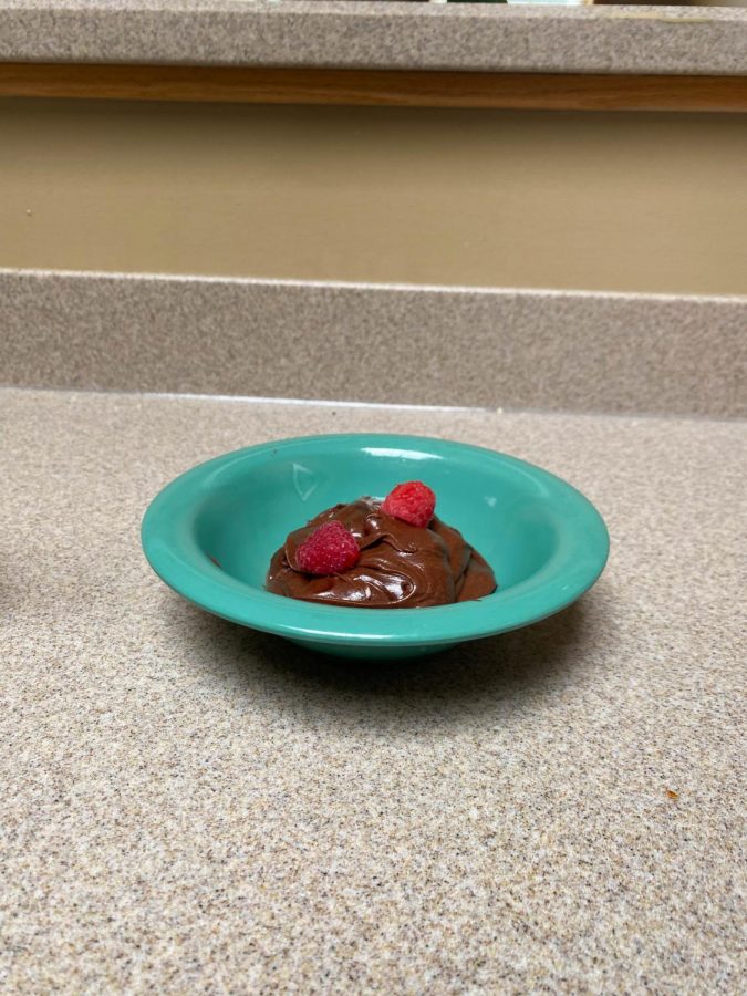
Upon returning to campus after Spring Break a few weeks ago, I was surprised to find that Café Mac had changed drastically. While we were all enjoying our week off, our cafeteria was undergoing a makeover. The plastic crates for cups turned into glistening metallic carts, the bowls in the salad bar became modernist and square, the fruit cart transformed into rustic-inspired buckets gracefully positioned around the cafeteria, and the olive oil and vinegar bottles were reconstructed into brilliant vessels of blown glass. These changes, as well as a few others, beg the question, “but why?” What has become of those well-worn containers that we’ve all come to know and love?
In all seriousness, why did Café Mac change? Was it because the old containers were falling apart? Was it to increase efficiency and avoid traffic jams? Or was it to give visitors a better impression of our dining hall? I reached out to the administration at Bon Appétit for comment, but did not receive a response. This article goes forward knowing that we don’t have an official answer to these questions.
Most of the changes with Café Mac were purely aesthetic. The new stand for the hot sauce, the pans to serve the dishes at East, the new cups for silverware, etc. Clearly, their purpose is to make Café Mac look fancier and more appealing. Some of the updates, however, served more functional purposes. The huge kiosk of fruit against the wall near the salad bar disappeared, and was replaced by buckets of apples and bananas (and sometimes oranges) scattered across the dining hall. Ladders with marbled-glass bowls filled with fresh Granny Smiths, a dinner plate laden with bananas of all sizes and buckets upon buckets of Fuji and Red Delicious. By replacing one kiosk that had all of the fruit and dispersing that across the dining hall, Bon Appétit has decreased the occasional fruit-inspired traffic jam.
I decided to talk to other Mac students to find out what they thought. I spoke to Ophir Gilad ’19, who told me her opinion on the updates. “I think [the changes are] largely unnecessary, I think that what Café Mac should be working on is improving the quality of the food rather than the actual presentation.” This is a valid point. Why did Bon Appétit spend money on presentation when it could have spent that money on improving the quality of the food, or increasing options for students with dietary restrictions?
The reasons why Café Mac did this are unknown, but it does raise eyebrows when functional equipment is replaced by shinier alternatives. Moving the fruit was clever, and it has helped to alleviate our overcrowded cafeteria. But apart from that, I’m left wondering why we felt like we had to fix something that was not broken.


Kylie Lawrence • Sep 12, 2019 at 7:15 am
An outstanding share! I have just forwarded this onto a colleague who had been conducting a little homework on this. And he in fact ordered me dinner due to the fact that I stumbled upon it for him… lol. So allow me to reword this…. Thank YOU for the meal!! But yeah, thanx for spending time to discuss this topic here on your internet site.
Isaac Knox • Sep 11, 2019 at 12:29 am
Hey very nice blog!! Man .. Beautiful .. Amazing .. I’ll bookmark your web site and take the feeds also…I am happy to find a lot of useful information here in the post, we need work out more strategies in this regard, thanks for sharing. . . . . .
Austin Allan • Sep 9, 2019 at 8:49 am
Saved as a favorite, I really like your site!